One of our long-time fans told us to never change the logo, because it’s tattooed in her hand. I never really wanted to change the logo – I admire the bands that have held on to their logo, no matter how unfashionable it may have become in the current aesthetic landscape. My favorite Swedish band, Kent had the same logo since their second album. The Finnish rock legend Apulanta has basically had the same logo since their first EP. So, the threshold to change the Unzyme logo was really high.
When Mary Violet decided to leave the band, we sat down with the rest of the band. Many of the things we had continued doing for years, felt like relics from the past. We had just kept on repeating the stuff we once did, and some of it felt outdated. We thought that we could do things better. The change in the band’s lineup felt like a good moment to re-think and redesign things.
The origin story of the logo
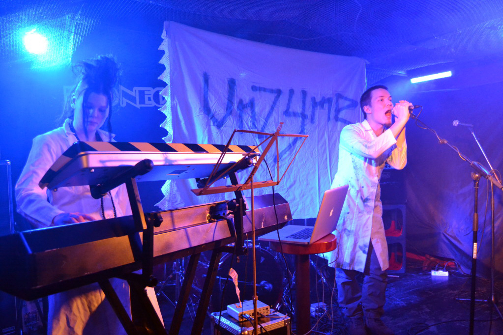
One of our first shows was at Ihmistulva, an event dedicated to educating people about climate change. I had drawn versions of the Unzyme logo on paper, but we didn’t have an official version of the logo yet. We needed a backdrop to display the band’s name, so I went to the closest flea market and found a green curtain with laces on the other end. I had the idea of the logo in my head, and now I needed to somehow transfer the idea from my head to the green curtain. I decided to get some green spray paint and just paint the logo on the blank canvas. Our first backdrop was born, and I liked the improvised logo so much that I wanted to make it the official logo. I took a photo of the spray painted logo and carefully digitised every curve and detail. I did some minor changes to it, but essentially it was the same hand-painted logo. Since then, it has been used on every Unzyme release, poster, sticker, website, lab coat and shirt. I truly wanted to hold on to this logo forever, but I was probably more in love with the origin story of the logo than the logo itself.

Spray paint has always been an integral part of the Unzyme aesthetics. It’s dirty, uncontrollable and fluid. There’s a certain level of randomness that we like. We’ve painted most of our gear with spray paint, and so the original style of the logo was also a statement of the DIY attitude that we still have. The way the logo is drawn affects how the logo is conveyed – the style is the message. And this became the reason why we decided to change the logo.
“Judging by the logo, you must play some kind of metal music”
We kept hearing this. When people encountered the logo for the first time, it was all too common for them to assume that Unzyme was a metal band. I had never seen it that way, possibly because I was no stranger to metal band logos. But it was true – our logo did not give the right impression of the music. We have always been a pop band, but in the recent years, even more so. When people encounter new artists, they instantly form an idea of the music based on the visuals. We wanted the message to be in line with the music, so changes needed to be made.


Redefined, not replaced
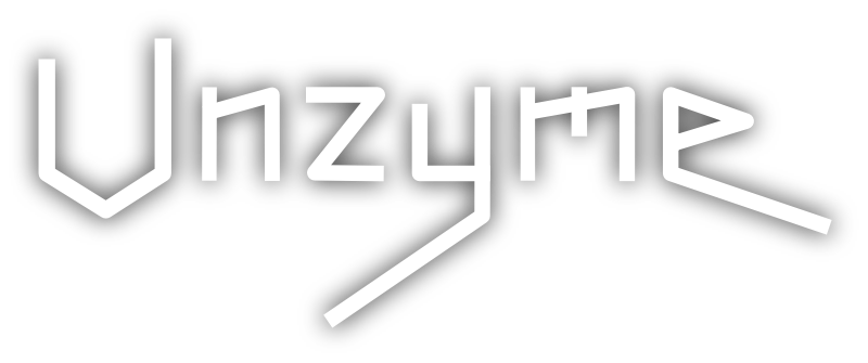
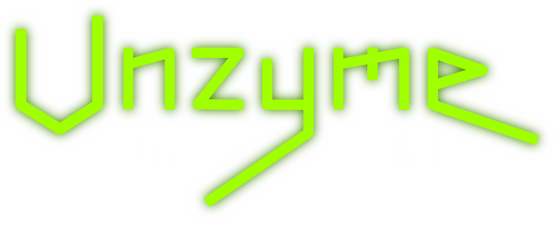
In a way, the new logo isn’t all new. It still has the defining characteristics of the Unzyme logo. This is basically the same logo I drew on paper even before the first official version was chosen. In my head, it’s a variation of the logo that I started drawing. It’s a version of the idea of the logo. It’s still made of straight lines, and the stretched out extremities of the Y and the E are still there. Daniel insisted on having the letter Z the same size as the other letters, and Ville suggested that the U flipped the other way, so that the higher end of the letter would be on the right. I did about a hundred variations of the logo, and ended up with this current, streamlined version, because it seemed to fit most surroundings. I tried to hold on to the hand-drawn look of the logo at first, but that would’ve limited the backgrounds too much. Initially I wanted to have way more details in the logo, and to have more “edge” to it, but I felt that the message wasn’t right. And that was the one thing we were trying to fix.
I hope you like the new logo, and can see why we changed it. We will hold on to this new version of the logo for as long as it looks like the kind of music we write.
Now we need a new backdrop. Back to designing!


